

Editors Note: This story has been updated. Please click here to read the most recent column.
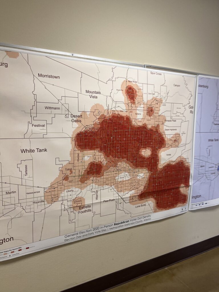
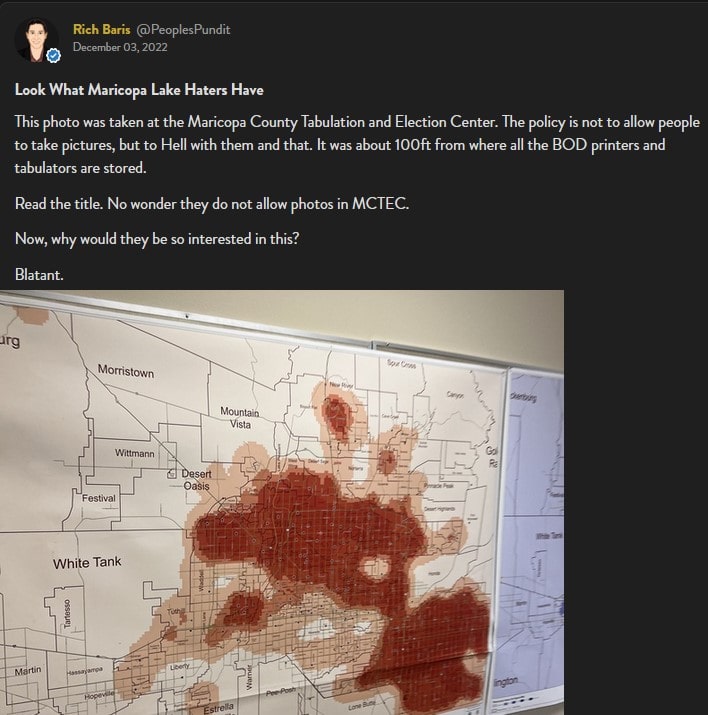
Richard “The People’s Pundit” Baris recently shared an interesting picture during his podcast—Inside The Numbers (Episode 307)—and in his Locals.com community. The photograph was one he took while inside the Maricopa County Tabulation and Election Center (MCTEC) soon after the recent Arizona midterm election. It showed a “Heat Map” reportedly hung on the wall inside the vote counting center titled:
General Election 2020 In-Person Republican Vote Dot Density
Election Day and Early Vote Sites | Metropolitan Maricopa, Arizona
Baris explained what made this map so problematic on the episode of Inside The Numbers.
Baris noted he did not personally observe a comparable map showing expected turnout from Democrats, Independent, or 3rd party voters anywhere else in the facility—the blue shaded map partially pictured to the right were locations of early vote drop-off/vote drop boxes as he recalls.
First and foremost, election officials would have no valid reason to need to track where voters would be expected to turnout by party. Maybe a case could be made election officials might want to know information about total voter turnout in order to best allocate their resources, but there is absolutely no good reason for the partisan break up—especially for just one party.
Richard Baris is a longtime political pollster and campaign consultant and owns the polling firm Big Data Poll. He has a great deal of experience working directly with political campaigns and election officials. He has never seen a map like this in a government facility. Just to confirm, Baris called around to contacts at several other secretary of elections offices in Florida and North Carolina to ask if they had anything like this in their offices. None of them did or even had heard of it being done before. As Baris quoted an election official from Carteret County, North Carolina (paraphrasing):
“No. […] It’s not relevant to what we do here. We count votes. We don’t predict where they come from.”
Baris also noted—when he originally posted the photograph on Locals—the map was located:
“[A]bout 100ft from where all the BOD [Ballot On Demand] printers and tabulators are stored.”
That presumably means Maricopa election officials readily had access to the heat map while preparing and certifying the election equipment—before sending the units out to the various voting locations.
It becomes even more problematic when you consider where the problems with the Ballot on Demand printers and tabulators actually occurred.
Baris compared the information displayed on the map to the results of polling he did on behalf of the Kari Lake campaign and the Arizona GOP (AZGOP). The first of the two large, deep red “blobs” in the northern part of Maricopa County encompasses parts of the newly created AZ-1 Congressional District. It was believed to be a fairly “safe” Republican district before the election, but was barely won by David Schweikert (R) by about 3,200 votes out of over 361K cast according to Decision Desk HQ—much closer than expected. According to Baris’ post-election polling, 30% of all voters who experienced election day problems with voting equipment in Maricopa were within this area on the heat map.
The other deep red “blob” in the southeast part of Maricopa covers parts of the AZ-2, AZ-5, & AZ-6 Congressional Districts. All three of these districts were considered either “safe” or “leans” Republican, but were all much closer than expected even though they were all still carried by the Republican candidates. Baris again states his polling shows the polling locations that experienced the vast majority of the election day equipment failure in these three races occurred inside the Republican-heavy areas identified on the map.
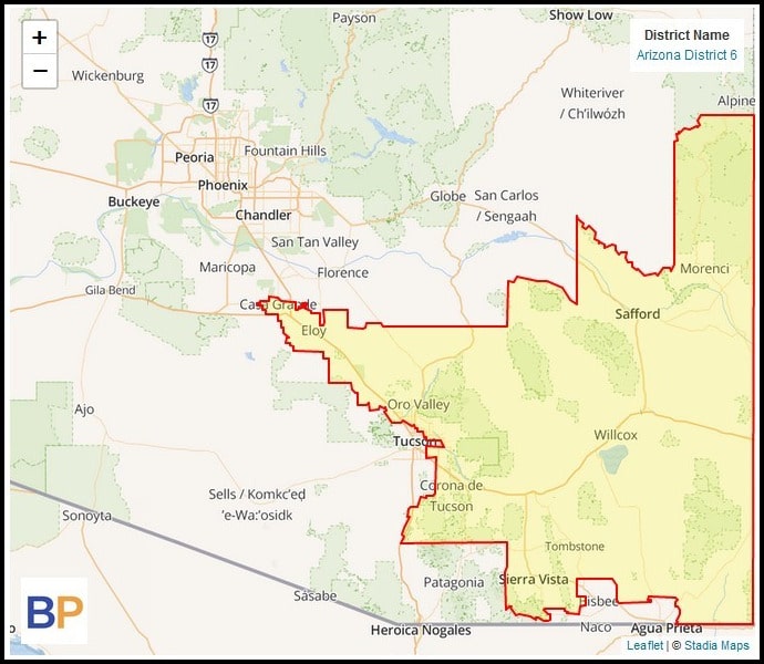
Baris specifically highlights AZ-6—which stretches from southeast Maricopa all the way down to cover a large portion of Democrat-heavy Pima County. According to Baris:
“In the areas where there are in blue counties in blue precincts, there were no malfunctions, tabulation errors, printer errors. Nothing, in what is now known as the 6th Congressional District.”
The last major point Baris makes in the segment is the cost it would require to produce this kind of map. As Baris puts it:
“As someone who does things like this for a living and plots this stuff. Do you have any idea how much money that costs? If I went to Datawrapper right now or Eye Maps and said, ‘I have a data set that’s 380,000 rows deep.’ [Do] you know how much it’s going to cost me to plot that, and then print out that map on that format in that big area? Why would you justify that expenditure if you’re MCTEC? Right! There’s only one reason why you’d do it. Let’s be honest.”
This also seemed to be confirmed by the Carteret County, NC election official mentioned earlier who Baris quoted (again paraphrasing):
“No. Couldn’t justify the cost for something like that.”
All told, County Recorder Stephen Richer, Supervisor Chairman Bill Gates, and the rest of the Maricopa County Board of Supervisors need to explain what was the purpose for having this map produced, and how was the expenditure of county funds justified and approved?
As Gates himself has previously stated, “This is what transparency looks like.”

The Washington Pundit | Speak Truth To Power
Follow me on Truth Social @AdamCarter
")
 and a Future Pandemic Will Make Xavier Becerra the Most Powerful Man in the US")


